























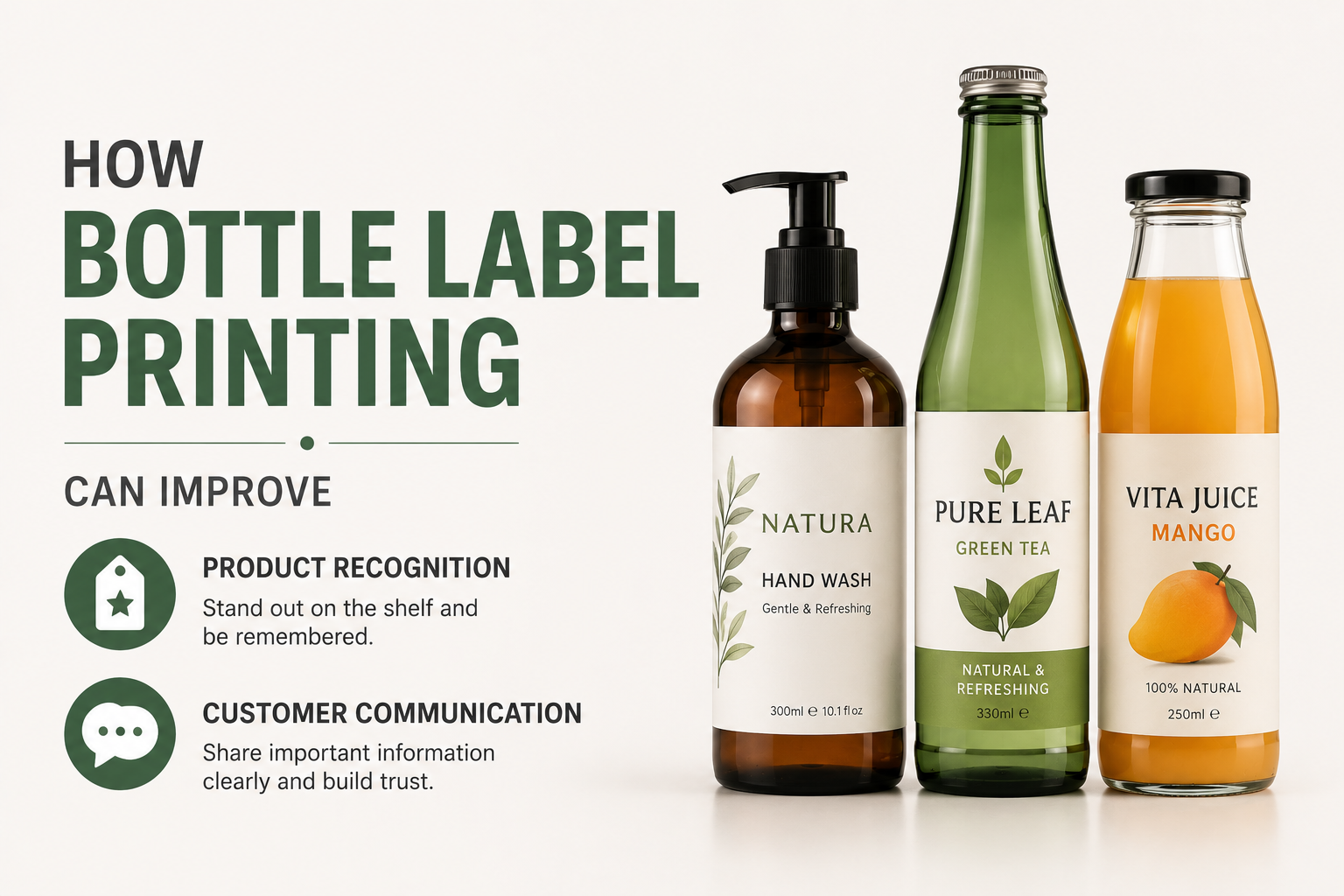
Professional bottle label printing can influence how easily customers recognise a product, understand its purpose, and distinguish it from similar options. A label has limited space to communicate a large amount of information, so every element needs to serve a clear purpose. From the product name and visual identity to instructions and supporting details, careful planning can help create labels that are easier to read and more consistent across a product range.
Customers often make quick decisions when viewing products, particularly when several similar options are displayed together. A clear label can help them identify what a product is and whether it meets their needs. At the same time, businesses need to ensure that important information remains organised and readable. Balancing visual presentation with practical communication is therefore one of the main considerations when developing a bottle label.
Creating a Strong Visual Hierarchy
A bottle label should guide the viewer through information in a logical order. If every element is given the same size and visual emphasis, customers may struggle to identify what matters most.
The product name is often one of the first details that needs attention. Supporting information can then be arranged according to its importance. This may include a product variation, description, instructions, quantity, or other relevant details.
Typography, spacing, and positioning can help establish this hierarchy. Larger text may be used for key information, while secondary details can appear in smaller areas without becoming difficult to read. The objective is to make the label understandable at a glance while still providing enough detail for closer inspection.
A clear structure can also make the product appear more organised. When information is crowded or poorly arranged, even useful content may be overlooked.
Making Products Easier to Recognise
Product recognition is particularly important for businesses that offer several related items. Customers should be able to identify the overall brand while also distinguishing between individual products.
A consistent design system can support this goal. Recurring elements such as logo placement, typography, and layout can create a connection between products. Variations in product names, imagery, or selected design details can then help customers identify different options.
Consistency should not result in labels that look almost identical. If customers cannot quickly distinguish one bottle from another, they may select the wrong product. The design needs enough variation to make each item clear while maintaining a recognisable relationship across the range.
This balance can also help when new products are introduced. A defined label structure provides a starting point while allowing product-specific information to be incorporated.
Designing for the Actual Bottle
A label should always be planned around the container on which it will appear. Bottle dimensions and shape can affect how much information remains visible from different angles.
Curved surfaces may reduce the amount of content that can be viewed at one time. Tapered bottles can create additional placement challenges, while smaller containers naturally provide less room for text and graphics.
Designers should work with accurate measurements and consider where the label will sit on the bottle. Important details should not disappear around a curve or become difficult to read because of the label position.
The relationship between the bottle and the label can also affect overall presentation. A design that looks balanced as a flat artwork file may appear different once applied to a three-dimensional container. Reviewing the design in its intended context can help identify these issues before production.
Keeping Essential Information Readable
Labels often need to include a substantial amount of information within a small area. The temptation to reduce the text size can create readability problems.
Customers should not have to struggle to locate or understand essential details. Appropriate font sizes, clear spacing, and sufficient contrast can make a significant difference. Long sections of text may also benefit from careful organisation so that information does not appear as one dense block.
Businesses should review labels at their actual production size rather than relying only on enlarged digital artwork. A design can appear perfectly readable on a large screen but become difficult to interpret once reduced.
Removing unnecessary wording can also create more space for important content. Concise communication often improves clarity and gives the design more room to function effectively.
Using Colour to Organise a Product Range
Colour can be a practical identification tool when used consistently. Different product varieties may use distinct visual cues to help customers find the correct option.
However, businesses should avoid relying on colour alone. Product names and other identifying information still need to remain clear. This is especially important when several colours are visually similar or when products are viewed under different lighting conditions.
Colour choices should also support readability. Text needs enough contrast against the background, and important information should remain visible rather than competing with decorative elements.
A planned colour system can make a product range easier to understand. Random changes between labels, however, may weaken consistency and make the range appear disconnected.
By planning labels around real customer needs and the physical characteristics of the bottle, businesses can create packaging that is easier to understand and recognise. Clear, consistent, and well-organised labels can support stronger product presentation while helping customers find the information they need.