






















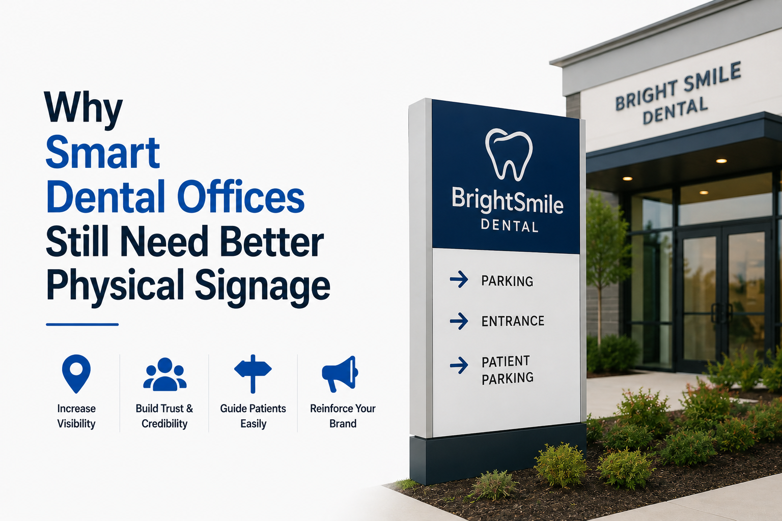
Dental practices have become increasingly digital. Online appointment scheduling, automated reminders, electronic patient forms, cloud-based records, and contactless payment systems are now common in clinics of all sizes. These tools save time and make daily operations easier, but they do not solve every communication problem inside the practice.
Once a patient enters the building, the physical environment takes over. They still need to find the reception desk, understand where to wait, locate the correct treatment room, and avoid walking into staff-only areas. Technology may help manage the appointment, but clear signage helps manage the patient’s movement through the office.
This is especially important for first-time visitors. A familiar layout may seem obvious to employees who walk through it every day, yet the same space can feel confusing to someone arriving for an appointment while anxious, distracted, or in discomfort.
Signage Is Part of the Patient Experience
The patient experience begins before treatment starts. It includes booking an appointment, arriving at the correct location, checking in, completing forms, finding the appropriate room, and knowing where to go after the visit.
Small moments of uncertainty can make that experience less comfortable. A patient who cannot immediately identify the check-in desk may wait in the wrong place. Someone looking for an X-ray room may open an office door by mistake. Parents visiting a pediatric dental practice may already be managing a nervous child and should not have to search for basic directions.
Well-planned dental office signs can support the entire visit by identifying reception areas, treatment rooms, consultation spaces, imaging rooms, restrooms, and private staff areas. They do not need to be elaborate. In many cases, a short and clearly displayed message is more useful than a sign crowded with instructions.
The goal is not to place a sign on every available wall. It is to provide the right information at the point where a patient is likely to need it.
Begin With the Patient’s Route
A practical signage plan can begin with a simple walk through the office from the perspective of a new visitor.
Start at the entrance and follow the typical patient route. Is the reception area immediately visible? If the practice has separate check-in and check-out counters, can patients distinguish between them? Are treatment rooms numbered consistently? Can visitors find the restroom without asking an employee?
This exercise often reveals minor gaps that staff members no longer notice. The route may be clear during quiet hours but more difficult to understand when the waiting room is busy or doors are closed.
The most useful signs are often found at decision points: entrances, hallway intersections, reception counters, and groups of similar-looking doors. Directional signs should appear before a visitor reaches the turn, while room identification should be placed where it can be read without blocking a doorway.
Changeable Signs Make Office Updates Easier
Dental practices rarely remain unchanged. A new dentist may join the team, an existing room may be assigned a different purpose, or the practice may expand its services. Printed labels attached directly to doors are inexpensive at first, but repeated changes can leave the office looking inconsistent.
A reusable sign frame with a replaceable insert provides a more flexible option. The frame remains installed while the name, title, room number, or message can be updated. This is useful for employee nameplates, treatment-room identification, consultation rooms, and administrative offices.
Standardizing the frames also helps the practice maintain a consistent appearance. When signs share similar fonts, colors, spacing, and materials, the office looks more coordinated even when the information changes.
This is a simple form of future-proofing. It does not require complicated technology, but it reduces the need to purchase and install an entirely new sign whenever a room or employee assignment changes.
Physical Signs Can Work Alongside Digital Systems
Digital and physical communication do not need to compete. They work best when each is used for the task it handles well.
A digital display in the reception area may show announcements, estimated waiting times, or payment information. A tablet can collect patient forms. Text messages can confirm appointments. However, permanent or semi-permanent room information is usually easier to communicate with a physical sign that remains visible without power, software, or staff assistance.
Sliding availability signs are another example. A treatment or consultation room can be marked as occupied, available, or in use through a small manual indicator. Employees can understand the room’s status at a glance without opening the door or checking another device.
For standard room labels and staff identification, changeable office door and wall sign frames can also provide a coordinated system across different areas of the practice. Using one frame style for offices, treatment rooms, and shared spaces creates continuity without requiring every sign to have the same dimensions.
Readability Matters More Than Decoration
A sign can match the office interior and still fail at its main job. Readability should come before decorative styling.
Text should be large enough to read from the expected viewing distance. The lettering and background need sufficient contrast, and highly reflective finishes should be avoided in areas with bright overhead lighting. Familiar terms such as “Check In,” “Treatment Room 2,” and “Staff Only” are generally easier to understand than creative alternatives.
Information should also follow a consistent naming system. Switching between “Operatory,” “Treatment Suite,” and “Patient Room” without a clear reason may confuse visitors. Choosing one format and applying it throughout the practice creates a more predictable environment.
Brand colors and logos can still be incorporated, particularly in reception and administrative areas. They should support the message rather than compete with it.
Accessibility Requires Separate Attention
Not every standard office sign is an accessibility sign. Dental practices should avoid assuming that a customized room label automatically satisfies accessibility requirements.
Under the U.S. Department of Justice’s 2010 ADA Standards for Accessible Design, certain signs identifying permanent rooms and spaces may need to meet requirements involving tactile characters, Braille, visual contrast, finish, mounting height, and location. The requirements that apply can depend on the sign’s purpose and the facility.
For that reason, practices should identify which rooms require compliant permanent signage before placing an order. Local building codes and project-specific requirements should also be reviewed. Decorative or changeable signs may complement an accessible sign system, but they should not automatically be treated as replacements for signs specifically designed and confirmed for compliance.
A Small Upgrade With Everyday Value
Physical signage may not receive the same attention as scheduling software or new clinical equipment, but patients and employees rely on it throughout the day.
A clear sign can reduce repeated questions at reception, help staff coordinate room use, protect private work areas, and make an unfamiliar office easier to navigate. Changeable systems also allow the practice to update information without gradually creating a mixture of temporary labels and mismatched signs.
The most effective dental offices connect their digital processes with a clear physical environment. Technology handles information before and after the appointment, while thoughtful signage supports the moments in between. Together, they create a practice that feels organized, professional, and easier to use.